1). Responsive Web Design.
I think the idea behind the article “Responsive Web Design” makes sense. Having a website that can adapt to whatever device is being used to view it isn’t just a no brainer, but what people would expect to happen. Having said that, I do have questions, like how much would someone’s experience on a website change depending on the device they use? Also, how difficult would it be to set something like this up or fix for that matter? Yes, I clicked on the links. No I still don’t get, forgive my being a novice. But the concept is great though.
2). Mobile web browsing overtakes desktop for the first time.
This is shocking said no one. Smartphones are not a want, but a need nowadays and everyone from grandma to your 3 month old cousin has one. What I have a problem with is Google focusing so much on mobile over desktop. It’s 3% Google, that’s not enough to play favorites when half of your consumer base still uses desktop (and for the record, I looked this up and desktop users are still ahead of mobile in a lot of areas as of 2019. https://www.perficientdigital.com/insights/our-research/mobile-vs-desktop-usage-study ). So just update them both Google.
3). 10 User Interface Design Fundamentals.
9 is the most important. The harder something is to use, the more likely a person is to scream at it while banging their head in frustration. Nobody has time for something that’s harder than it needs to be, or patience for that matter. Ask me about Mirror’s Edge, you’ll get a great demonstration of how fast someone’s blood pressure can shoot through the roof in under a millisecond.
4). 10 Most Common Web Design Mistakes Small Businesses Make.
In all honesty, mistakes 1, 2, and 4 as well as 7-9 is summed up in mistake #3. They are potential factors in causing confusion, which can lead to frustration which leads to, well… have you asked about Mirror’s Edge, yet ?
5). All About Grid Systems.
My response to this article is the same as Responsive Web Design. The concept I can get behind, kind of; actually understanding it, not so much. I mean, if you’re starting out then having a framework to help you sounds great. But it involves math; I’m a novice and this involves my least favorite subject. Colored me intimidated.
6). 50 Examples of Responsive Web Design.
This has got to be , hands down, one of the coolest websites I have ever been on. And the fact it has has guides and information that a novice like me can use. I don’t know if I’ll understand half of it, but I may have found a new best friend.
7). Pattern Trap.

Clean design, easy to use, and IT HAS CATS and a bunch of other cute animals to exemplify the meaning of what they’re asking. This is really different to what I would expect a website like this to you, but I’m not complaining. I went to the website too and the whole thing was great.
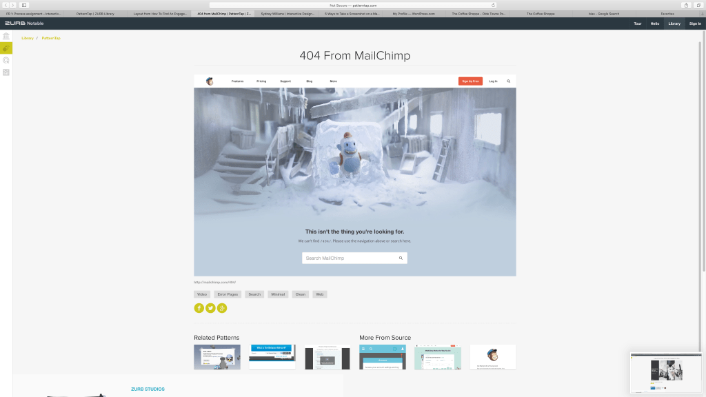
It’s a cute, well designed, high quality error message. While it may not be what you’re looking for, at least you get something really adorable to look at.
8). Dribble

At first I thought the message of this was you’re a work of art, which is what attracted me. I actuality it’s about “…the careers we pursue everyday and the passion we seek.” to quote the artist. That is something that many, including myself, try to do: find balance between what we have to do and what we love.
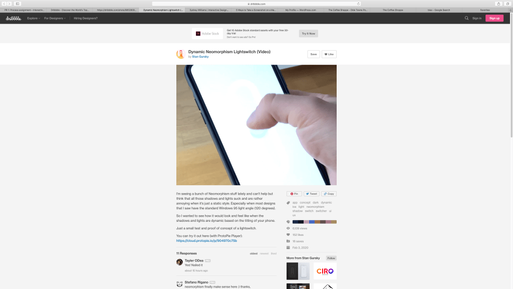
As trolly as the reason behind this seems, I think it’s cool that you can augment the look of a web page like this.
9). Style Tiles
Honestly, Style Tiles look like they’re mini style guides, so yes I’ve done something like them before. It does really seem useful to show examples of you work like this since it so much room for change and saves yourself on time and effort.
10). 3 Restaurants
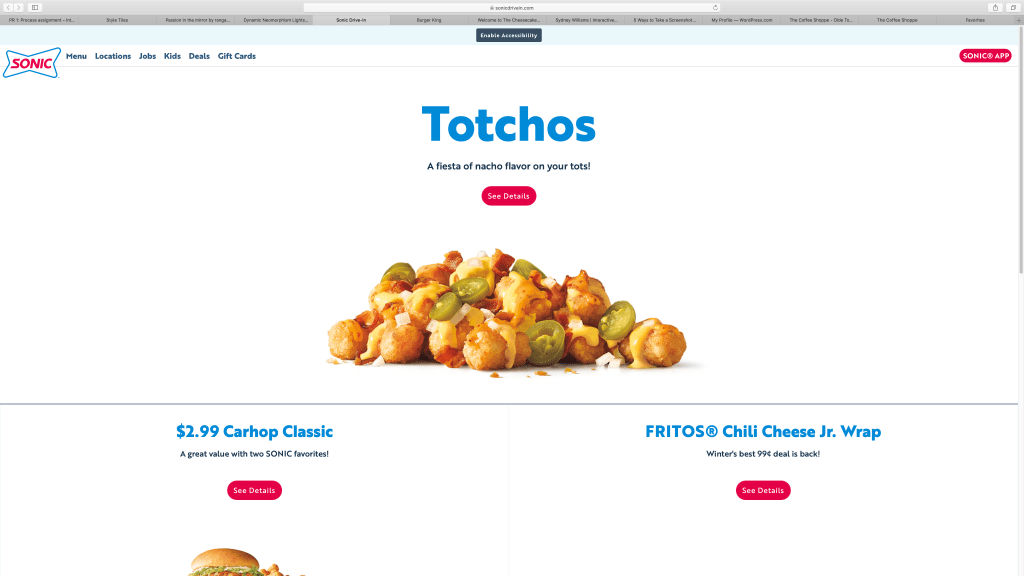
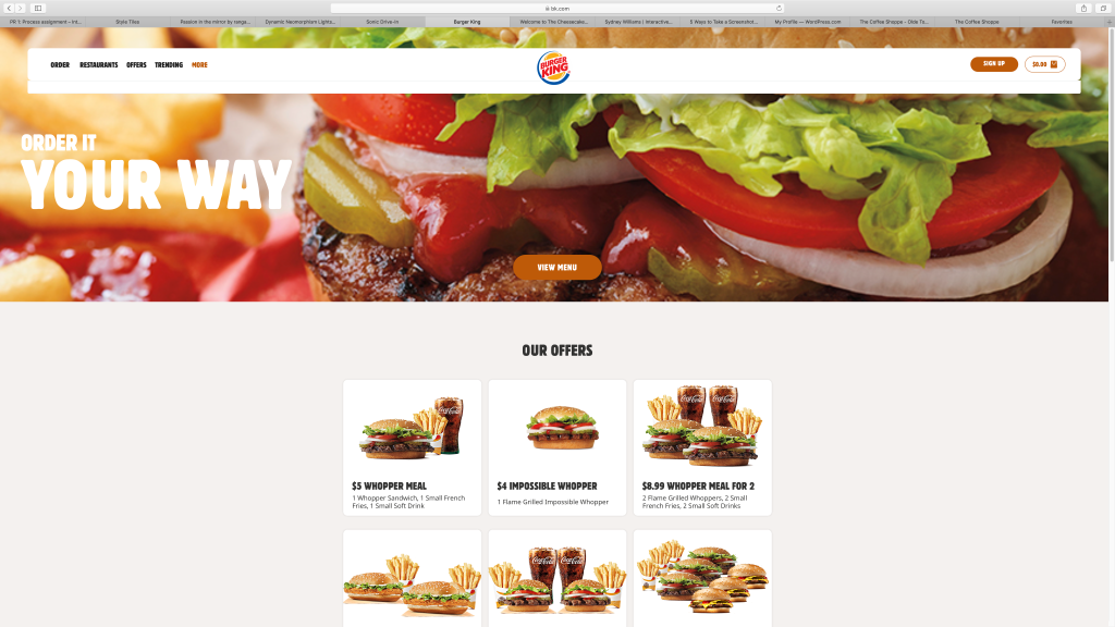
Burger King’s the winner, winner chicken dinner.
The 6 major section pages are: Order, Restaurants(which is just another order page really), Offers, Trending, and More, which leads to the menu page.
I guess the images of food on the site are multimedia, especially the ones on the menu since they move, I don’t know. Having those menu pictures move isn’t really useful in my opinion, it’s just there.
Th overall look is really simple with a handful of colors. It’s really all about the food and there’s nothing that will confuse this design wise. Allergens and nutritional info are displayed in a was that draws your attention and is easy to read.
Reason to visit the site for reasons other than store hours, location, and menu are: to take the survey for a coupon, download their app, check out their new offers, do anything related to the Burger king gift card, and apply for jobs.
Finding the menu from the main page was more trouble than necessary, especially when before when the visible menu button on the homepage was just another order button. They should just make the More tab say menu, because that’s all it is.
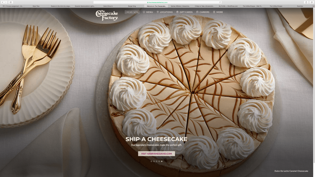
Sonic’s site was like Burger King’s, just not as good. It had unnecessary and misleading sub-pages with information that could have been either placed in the relevant page or left out altogether. As for The Cheesecake Factory, their menu was annoying. It was this tiny window in the middle of the page instead of utilizing the space, unlike literally every other page on the site, with missing pictures and no information on nutrition or allergens. In short, it made no sense and behind on the times.
